
This is a thing:
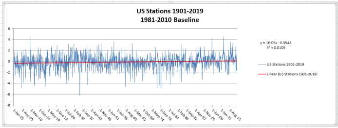
The above is the NOAA GHCN Monthly data for the United States, turned into anomaly form. Starting with the 12,355 stations recorded in the data and working with an Oracle database, I built a table of baseline averages for each calendar month over the 30-year period 1981 – 2010. With 12 months in the year and a 30-year baseline, a full data set would have 12 X 30 records, or 360 separate monthly summaries. I used 345 records as a low cutoff, and only used stations that could build a full 12-month baseline. That left me with 1807 stations.
Once that was completed, I took each station from the main data table that matched a station in my baseline table, and subtracted that 30-year average for the calendar month from the matching station record. This was done for the period Jan 1900 through Mar 2019. The final result was a monthly, 120-year record of anomalies for that station.
Finally, I used Excel to plot the data, with the result above. I looked at that result with not a little skepticism. Looked awfully flat, especially that trend line. That’s about a quarter-degree of warming over 120 years. I did the numbers three more times, using slightly different methods, and checking intermediate data to make sure I was wandering off-track somewhere. What I really needed was another record to check my results against.
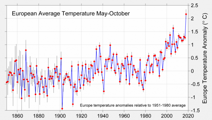
I went over to the Berkeley Earth BEST webpage and looked around for something I could perhaps reproduce. Their methods are way more sophisticated than mine, and most of them incorporated sea temps, which I don’t have. Still, I found this:
I have that data, and I adjusted my baseline to the same 1951-1980 period in my database queries. I pulled in data using the same criteria and methods as I did with the other graph, and this was the result:
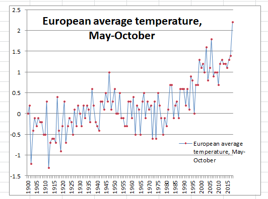
I don’t have data as far back as BEST does, so I superimposed my graph over the same range of the BEST chart. I think it’s a pretty good fit, considering our no-doubt-vast difference in processing.
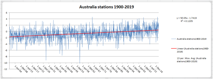
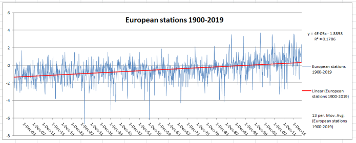
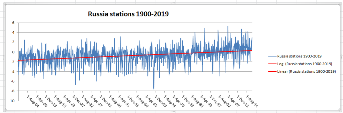
It’s hard to see, but BEST’s lines are a darker blue than mine, and my markers are blue and BEST’s are red. It’s a really good fit, which gives me confidence that my US chart is valid, too. I also did charts for Europe, Russia, and Australia. I’ll leave those here with no comment; it’s late, and there’s not all that much to say, anyway — they all look more like what one would expect.
Have a pleasant evening.


